
At Calm Engine, we believe a strong brand identity is more than just visuals — it’s a statement of purpose and presence. That’s why we were excited to partner with Kuvan Logistics, a dynamic player in the global logistics space, to craft their complete visual identity — from logo design to typeface, colour palette, and brand tone.
About Kuvan Logistics
Kuvan Enterprises is positioned as a gateway to global logistics and transportation solutions. Their mission is clear: to connect possibilities and deliver with consistency, scale, and trust. With a future-focused mindset, Kuvan needed a brand identity that reflected its efficiency, reliability, and modern edge — without losing a sense of timeless professionalism.
The Brief
Kuvan approached Calm Engine to develop:
A distinctive logo and brand mark
A full visual identity system including colours, typeface, and usage guidelines
A look and feel that balances boldness with elegance, suitable for both digital and physical applications (packaging, documents, signage)
Our Approach
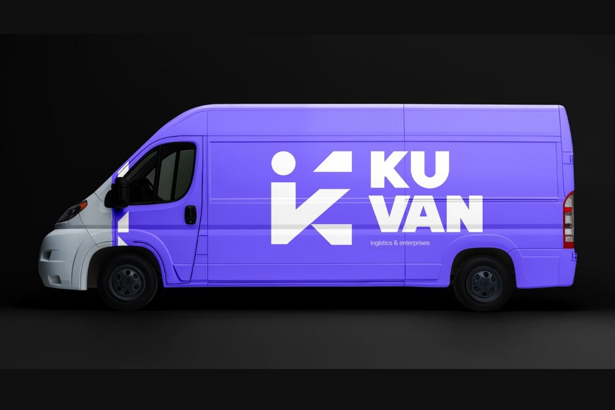
1. The Logo: The Stylised ‘K’
The centrepiece of Kuvan’s brand identity is a stylised letter ‘K’, designed to feel dynamic, structured, and scalable — just like the services Kuvan offers. It’s clean yet memorable, symbolising direction, connectivity, and motion — key elements in the logistics space.
2. Typeface: Creato Display
We selected Creato Display for its modern lines, clarity, and versatility. This typeface supports a bold presence in both large format and digital interfaces, ensuring that the brand’s tone remains sharp and professional across platforms.
3. Colour System: Confident & Contemporary
We created a distinctive colour palette to give Kuvan a unique visual signature:
Primary: Cornflour (#7367FF) – A confident, sophisticated shade of blue-purple that signals innovation and trust
Secondary: Aluminium (#9EA1AD) – A neutral tone that complements and grounds the design
Accent: Black (#000000) – For sharp contrast and bold presence
Support: Off-White (#F3F3F3) – Clean, minimal, and space-enhancing
Together, these colours deliver a look that is both professional and progressive, helping Kuvan stand out in a traditionally conservative industry.
The Result
The new brand identity for Kuvan Logistics is bold, clean, and future-ready. It positions Kuvan as a reliable partner in global logistics while also hinting at a modern, agile approach to doing business.
Whether on a business card, cargo manifest, or company website — the brand feels unified, polished, and powerful.
If you’re a business aiming to scale, connect, and lead in your domain, Calm Engine is here to help. From branding to websites to digital strategy — we create solutions that move your mission forward.
Let’s build something impactful together.
Kuvan Logistics
Branding
Kuvan Logistics
February, 2025
1 Month
Call us — we’d love to hear your goals and explore how we can help.

Smart design. Strategic digital marketing. Built for every business, not just the big ones.
© 2025 Calm Engine
